CRO
11 CRO Non-Negotiables Before We Touch Ad Spend

Before we turn on a single dollar of paid spend, we run every landing page through 11 non-negotiable checks: five-second clarity, message match, single CTA, mobile parity and speed, form friction, trust signals, session recordings, checkout friction, landing page destination, the thank-you page, and conversion tracking. Most take one working session, and together they make sure the traffic you're about to pay for lands on a page built to convert it.
I don't have one landing page that sticks out. Honestly, that's kind of the point.
I've seen pages that are scattered everywhere, no idea what to look at first. Ads that promise one thing and land on a page talking about something else entirely, like the ad and the page have never met.
Pages with four different buttons all fighting for the same click.
Pages so vague you finish reading and still can't tell me what the company does.
And then there's the one I see more than any other: pages that ask for the relationship before the first date. Someone hasn't even decided if they like you yet, and the page is already asking them to hand over their phone number and book a call.
You gotta date first. Some offers are ready for a "call me." Most need a "let's grab coffee" first.
None of these are rare. They're the norm.
That's why we don't eyeball a landing page and call it good. We run it through the same 11 checks, every time, before a dollar of spend goes near it.
We've said it before: Google Ads is one part of a three-part equation, Traffic, Conversions, Signal, and most campaigns have Traffic dialed in before anyone thinks about the other two.
This post lives in the Conversions part. Specifically, in the part that happens before a dollar of ad spend goes live.
Here's the thing about paid traffic: it's colder than organic traffic. Someone who searched three different ways, read two comparison articles, and then clicked your ad has done a lot of the convincing themselves.
Someone who clicked a cold prospecting ad hasn't. Your landing page has to do all of that work, fast, with someone who's never heard of you and has zero patience to figure it out.
So before we turn spend on, or scale it up, we run the page through these 11 non-negotiables. Here's what they are, in the order we run them.
| Check | The question it answers | Free tool that helps |
|---|---|---|
| 01 Five-second clarity | Can a stranger understand this page in five seconds? | Attention Insight |
| 02 Message match | Does the page say what the ad promised? | Dynamic Text Replacement |
| 03 Single CTA | Does every button on the page earn its place? | Manual audit |
| 04 Mobile parity & speed | Is mobile getting the weaker version of the page? | PageSpeed Insights |
| 05 Form friction | Does the ask match the trust you've earned? | Zuko |
| 06 Trust signals | Would a stranger believe this business is real? | Trustpilot, G2 widgets |
| 07 Session recordings | What do real visitors actually do on the page? | Microsoft Clarity |
| 08 Checkout / lead-capture friction | How hard is it to finish what they started? | Manual walkthrough |
| 09 Landing page destination | Is the ad landing on a page built for it? | Manual audit |
| 10 The thank-you page | What happens right after they convert? | Manual audit |
| 11 Conversion tracking | Are the numbers even true? | Manual validation |
Five-second clarity: can a stranger understand the page in five seconds?
We don't run this through a tool.
After enough landing pages, you can look at one and know within about five seconds whether a stranger would understand it.
That's not a brag, it's just what happens when you've seen the mismatched-ad-and-page problem enough times to spot it on sight.
Here's what we're actually checking in that first scan:
- Is this one page, or does it feel like five pages stacked on top of each other?
- Is there one clear thing to look at, or is my eye bouncing between a headline, a banner, a popup, and three different buttons all asking for attention at once?
- Could this headline belong to any company in your industry, or does it belong to this one?
If you don't have years of pattern-matching to lean on, there are tools built to do this systematically, and you don't need to get clever about it.
Attention Insight uses AI-predictive eye tracking.
Upload a URL or image and it shows you a heatmap of where a first-time visitor's eyes are likely to go in those first few seconds, built from millions of real eye-tracking data points. No live traffic needed, so you can check this before the page ever goes live.
Either way, the goal's the same: know before you spend a dollar whether the page can hold up to a stranger's first, fastest impression.
Message match: does the page say what the ad promised?
This one's simple to explain and easy to get wrong: does the page say the same thing the ad said?
Someone clicked because of a specific promise.
- A specific headline
- A specific offer
- A specific "this is exactly what I need" moment
If the page doesn't pick up that exact thread, in close to the same words, the visitor's first thought isn't "let me read more."
It's "wait, is this the right page?"
And that split second of doubt is often all it takes to lose them.
We check that these three things are lined up:
- The headline
- The offer
- The CTA
All three in the language the ad actually used, with the same urgency and the same specific promise that made someone click. A rewritten, "on brand" version of the promise reads like a different promise.
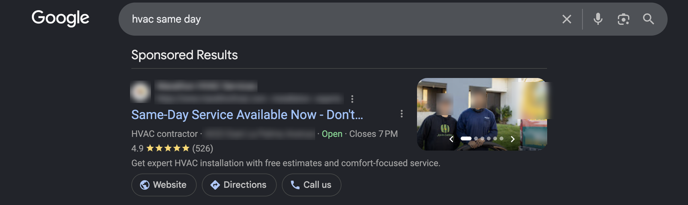
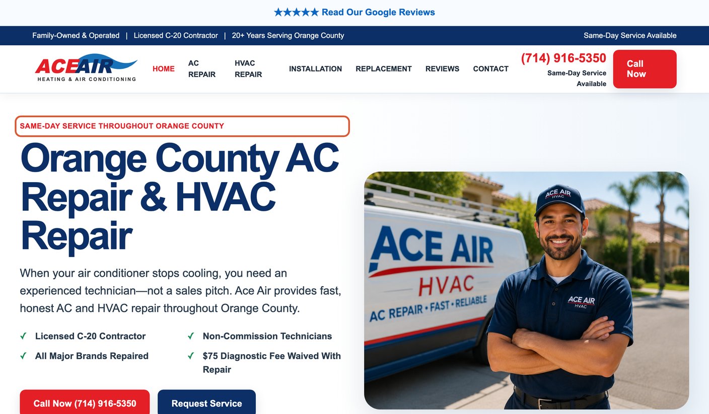
Here's what that looks like in the wild, starting with a search for "hvac same day." This ad picks up the search perfectly:
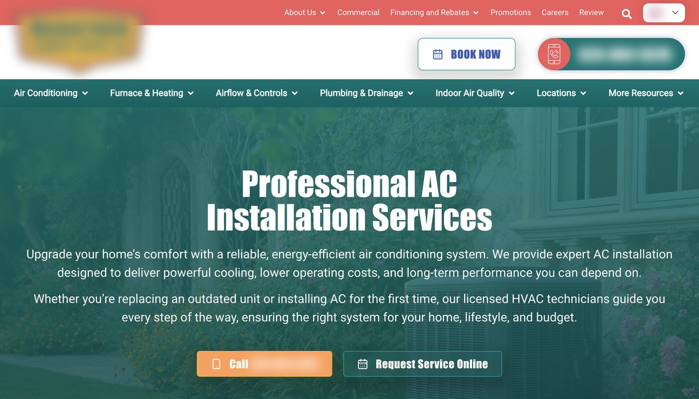
Now here's the landing page that ad sends people to. The visitor who clicked for same-day service lands on a page that never says it:
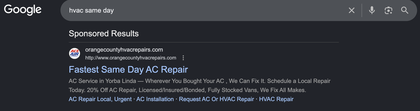
Compare that with another ad for the same search. Keyword and ad, matched again:
And this time the page carries the promise all the way through. The keyword matches the ad, and the ad matches the page:
A note on RSAs and message match
This gets hard with RSAs (Responsive Search Ads).
Google mixes and matches your headlines and descriptions into combinations you don't fully control, so pinning one exact headline to guarantee message match sounds like the obvious fix.
Here's the catch: pinning tends to lower your ad strength score.
We've watched it happen in real accounts. Unpin a headline and the rating climbs right back up.
So instead of fighting for one exact headline, we write for theme, not for a single sentence.
Every headline variation in the ad group should be able to promise the same thing in different words, so no matter which combination Google shows, the landing page headline is still telling the truth.
And on the landing page side, tools like DTR (Dynamic Text Replacement) can pull the actual search term into your headline automatically, so the page adapts even when the ad itself is a moving target.
Single CTA: does every button on the page earn its place?
I used to preach one CTA. No exceptions. One page, one offer, one button, and if you gave me a page with two, I'd tell you to pick a lane.
I still mostly believe that. I just don't think it's the whole rule anymore.
Here's where it gets interesting: two pages can both have two CTAs on them, and only one of them is actually breaking the "single CTA" idea.
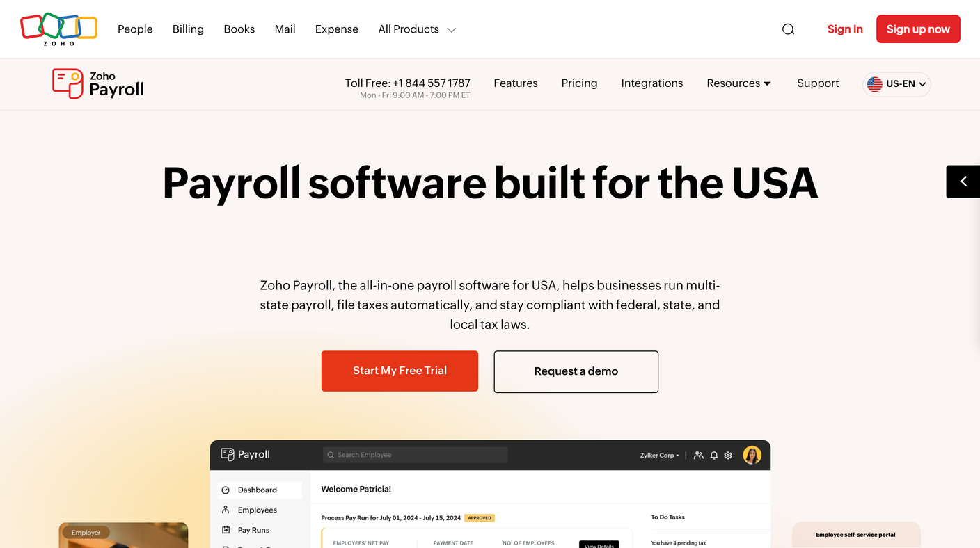
Take a keyword like "payroll software."
Sounds like one search, one intent. It's not.
It's a small business owner who's done with their current provider and ready to switch today, they just want to poke around and see the product for themselves.
And it's an HR lead at a bigger company, mid-evaluation, thinking about integrations, compliance, what happens if this goes sideways, who isn't clicking a "start trial" button for something that touches every paycheck at the company.
Same keyword. Two completely different people standing behind it, wanting two completely different offers.
Give both of them one CTA, and you're just guessing which one you'd rather have. Give them Book a Demo and Start a Free Trial, side by side, and you stop guessing. They tell you.
Now take a completely different search: "same day HVAC service."
My first instinct was, easy, one CTA, "Book Now," done.
But I kept poking at it, because something about that felt too clean.
And here's what I landed on: there's no version of that visitor who's mid-evaluation, comparing vendors, thinking it over.
Someone with a broken AC in July wants one thing, a technician, today.
What's actually different between two visitors on that page isn't what they want. It's how they want to ask for it.
Some people call, because a real voice on the phone feels faster when it's urgent. Others hate the phone and just want to book online without talking to anyone.
So that page might also have two buttons, Call Now and Book Online, and it still isn't breaking the rule, because both buttons lead to the exact same outcome. It's not two offers. It's one offer, in two formats.
That's the actual distinction I was missing when I first thought about this: are you looking at two different buyers who need two different offers, or one buyer who just wants a choice in how they reach you?
Payroll is the first kind. HVAC is the second.
They can look identical on the page, two buttons, side by side, and still be doing completely different jobs.
What still hasn't changed: every CTA on the page has to earn its place.
If a second button shows up because the page is overexplaining something, or hedging because the offer isn't clear, that's still a message match problem hiding behind a UI decision.
But if it shows up because two real buyers need two real doors, or one buyer needs two real ways to knock, let them both in.
Mobile parity & speed: is the phone getting the weaker page?
We load the page the way a real visitor would, on an actual phone, on real network speed, not a resized browser window on a desktop monitor.
Then we compare that experience directly against desktop: same clarity, same load time, same ease of taking action.
Most paid traffic lands on mobile first. A form that's a quick fill on desktop can turn into a frustrating, pinch-to-zoom mess on a phone.
A CTA that's obviously visible on a 27-inch monitor can get pushed below three scrolls of content on a 6-inch screen. If the mobile experience is the weaker version of the page, and most of your traffic is mobile, you're optimizing for the visitor you're least likely to get.
A few specific things we check:
- Can every tap target actually be tapped without zooming in first?
- Does the form still feel short on a small screen?
- Is the CTA visible without excessive scrolling?
- Does anything on the page break, overlap, or get cut off on common screen sizes?
Worth knowing if you're checking this yourself: Google retired its old Mobile-Friendly Test tool in 2023. PageSpeed Insights is the current, free way to check this, it folds mobile usability into the same report as speed and Core Web Vitals, so you get the full picture in one look.
A real one, from this week
We had a client's AI implementation landing page get flagged "Below average" for landing page experience inside Google Ads. We ran it through PageSpeed Insights and found a mobile performance score of 32 out of 100.
No copy changed. No design changed. No layout changed. The problem was entirely technical, and most of it traced back to one thing: an animated background effect on the hero section that was redrawing itself in the most expensive way possible, eating close to all of the phone's processing budget just to load the page.
We used Claude Code, connected directly to the site, to ship the fix the same day we found the problem.
We rebuilt the animation to look identical while costing a fraction of the resources, and dropped a 184 KB JavaScript framework that only existed to support the old version.
We also deferred a few tracking scripts (session recording, visitor ID, chat widget) to load just after the visitor's first tap instead of competing with the page for attention on load, fixed 66 accessibility contrast failures that were too light to meet the standard Google checks against, and verified every conversion tag still fired correctly, down to submitting a real test lead and watching it land.
Same lab test, same day:
- Mobile performance went from 32 to 61
- Total blocking time, how long the page is frozen and unresponsive to a tap, dropped from 12.5 seconds to 0.3
- Time until the page is actually usable went from about 90 seconds to about 8
Google Ads bases its landing page experience rating on accumulated real-visitor data, so a score like this takes a couple weeks of traffic to fully show up on the ads side.
But the technical problem itself, the thing actually slowing real visitors down, was fixed the same day we found it.
Form friction: does the ask match the trust you've earned?
Filling out a form isn't a neutral action for the person doing it.
It's a small transfer of trust.
An email address feels minor to us because we ask for it fifty times a day, but to the person giving it up, it's an invitation into their inbox, and the most common thing waiting on the other side of that invitation is spam they didn't want.
A phone number is a bigger ask.
A budget range can feel like showing someone your hand before you've decided you're playing the game at all.
The level of ask in a form should match how much trust has actually been built by the time someone reaches it.
This is where a lot of forms get it backwards. A TOFU (top-of-funnel) visitor, someone who just discovered you exist through a cold ad, hasn't built any trust yet.
Asking them for a name, email, and phone number in the same breath is asking for a level of commitment the relationship hasn't earned. That visitor needs to be nurtured first, not converted on the spot.
A BOFU (bottom-of-funnel) visitor is different. They've compared options and know what they want, and asking too little of them can feel underwhelming, like the offer isn't substantial enough to be worth much.
One of the best tools for solving this is a multi-step form, and the reason it works isn't just that it looks shorter. It's sequencing.
Start with a low-threat question.
- How big is your company?
- What are you looking to solve?
Something easy to answer, something that costs the visitor nothing to admit.
Each small answer is a tiny commitment, and once someone's answered the first question, they're a little more invested in finishing than they were before they started.
By the time the form reaches the actually sensitive ask, name, email, phone, the visitor's already partway through a process they've decided to complete, rather than staring down the whole risk at once.
From there, we go field by field.
- Does this need to be required?
- Does it need to be collected now instead of during onboarding or the first call?
- Is there a shorter way to ask the same question?
- A dropdown instead of a free-text field.
- A single name field instead of separate first and last.
Fewer required fields, more optional ones, wherever the business can actually work with partial information.
Here's what the backwards version looks like. A search for "recruiting software," broad, early-stage, no "demo" or "trial" attached, pulled up a form asking for seven required fields before showing anything: name, phone, business email, company, company website, number of employees, all at once, no sequencing.
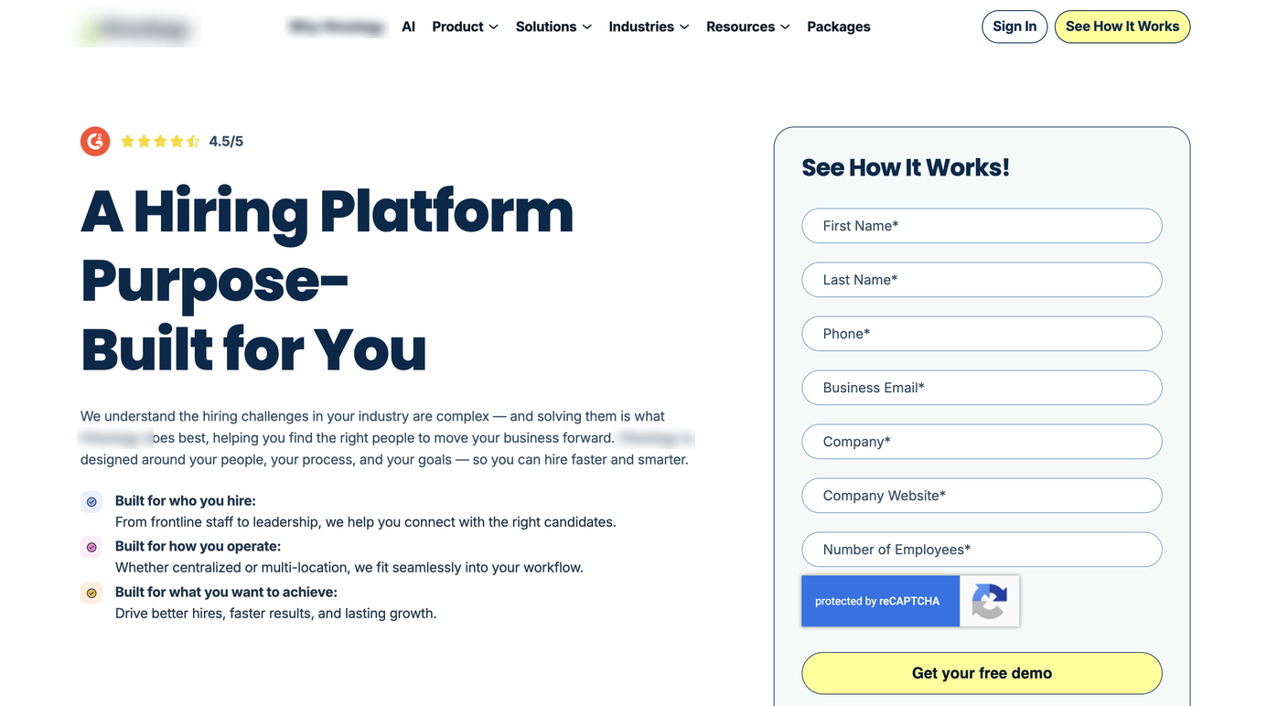
Company website is the one that stands out. That's not information needed to see how something works, it's a field that makes someone feel sized up before they've decided they're even interested. A BOFU ask sitting on a TOFU page.
If you want to see this at the field level instead of guessing, Zuko tracks exactly where people hesitate, correct themselves, or abandon a form entirely, field by field, so you know precisely which one to fix first instead of shortening the whole form and hoping.
Trust signals: would a stranger believe this business is real?
This one connects straight back to the threat we just talked about in forms.
If asking for information is a risk to the visitor, trust signals are what make that risk feel smaller before they ever reach the ask.
We look at whether a stranger, someone with zero prior experience with the business, has a reason to believe it's legitimate and capable within the first scroll.
- Reviews
- Client logos
- A guarantee
- Real contact information
- Something that says "other people already trusted this, and it worked out."
What counts as a real trust signal shifts by business type.
For ecommerce, it's often reviews with actual names attached, security badges near the payment step, and clear return or shipping policies, since the threat at that moment is financial:
- Is my card information safe?
- Will the product I'm paying for actually show up?
For B2B and SaaS, it's usually client logos, case studies, or third-party validation like G2 or Capterra reviews, since the threat is more like professional risk:
- Will I look foolish for recommending this internally?
For local and service businesses, it's often the simplest signals that matter most, a real address, a real phone number, a handful of reviews with names, because the threat is closer to "is this a real business at all."
Two companies doing this well, in two different ways worth knowing about.
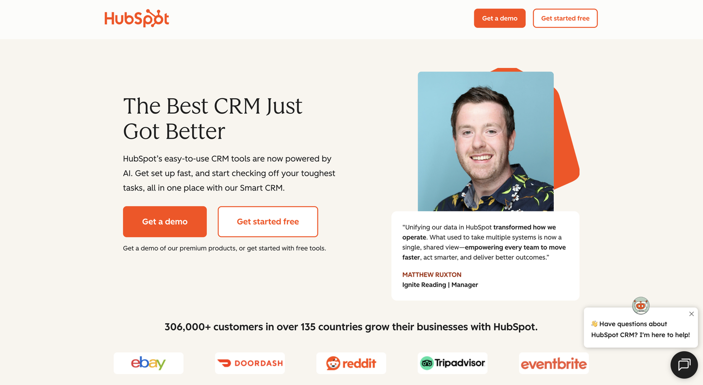
HubSpot runs the traditional playbook and runs it well: a named testimonial, full name, title, and company attached (Matthew Ruxton, Manager at Ignite Reading), sitting right next to recognizable client logos, eBay, DoorDash, Reddit, and a specific number, 306,000+ customers in 135 countries.
Every trust-signal type doing its job in one hero.
Attio is doing something newer, and it's worth paying attention to.
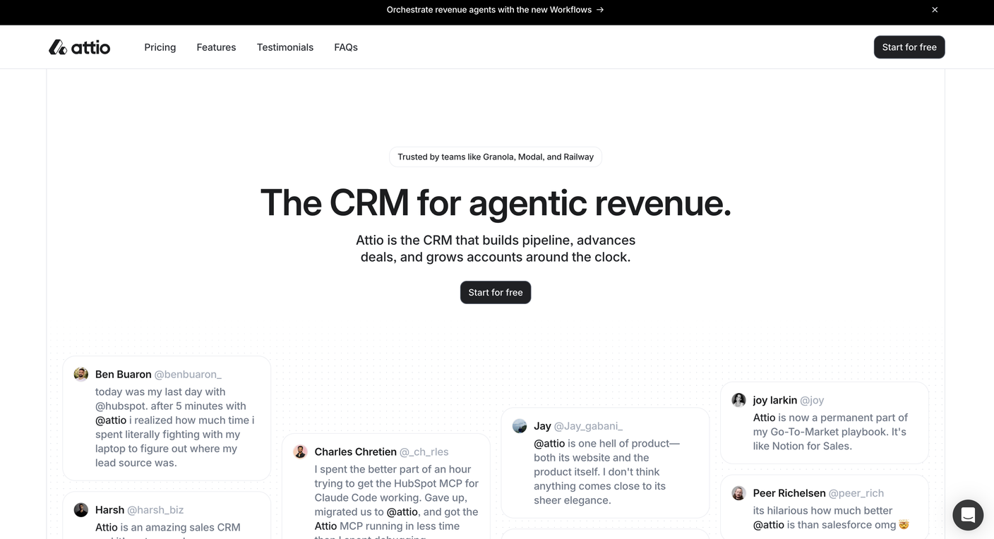
Instead of a polished testimonial card, the hero embeds real social posts, actual handles, casual language, someone saying it's "hilarious" how much better Attio is than Salesforce.
That unpolished, clearly-not-written-by-marketing tone is exactly why it reads as more credible than a curated quote would.
Trust signals are evolving the same way word-of-mouth always has, people trust what looks like a real person saying something offhand more than they trust a brand telling them what to think.
Good trust signals have to arrive on time, though.
One pest control company's local landing page pairs real, detailed Google reviews (over 3,500 of them) with BBB accreditation, an Inc 5000 badge, and a Top Workplaces award, a genuinely strong set for a local service business, stronger than many in the category.
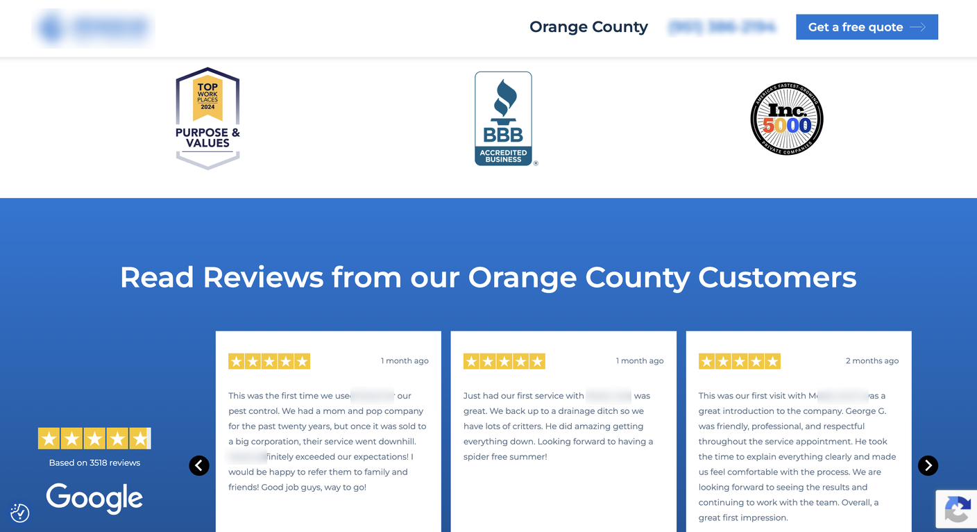
But all of it sits below the fold.
A visitor has to scroll to find any of it. A hesitant visitor is exactly the one least likely to keep scrolling to go looking for a reason to trust you.
The signals only do their job if they're seen before the hesitation turns into a bounce.
An easy fix here (and worth a test): pull the star rating and review count up into the hero right next to the CTA.
Doesn't take much space. "4.9 stars, 3,500+ reviews" sitting beside the button carries most of the weight the full review section does further down, and it's seen at the exact moment someone's deciding whether to click.
I like this example from HappyFox, where the ratings sit directly below the email field and CTA, popping out, in the hero and above the fold.
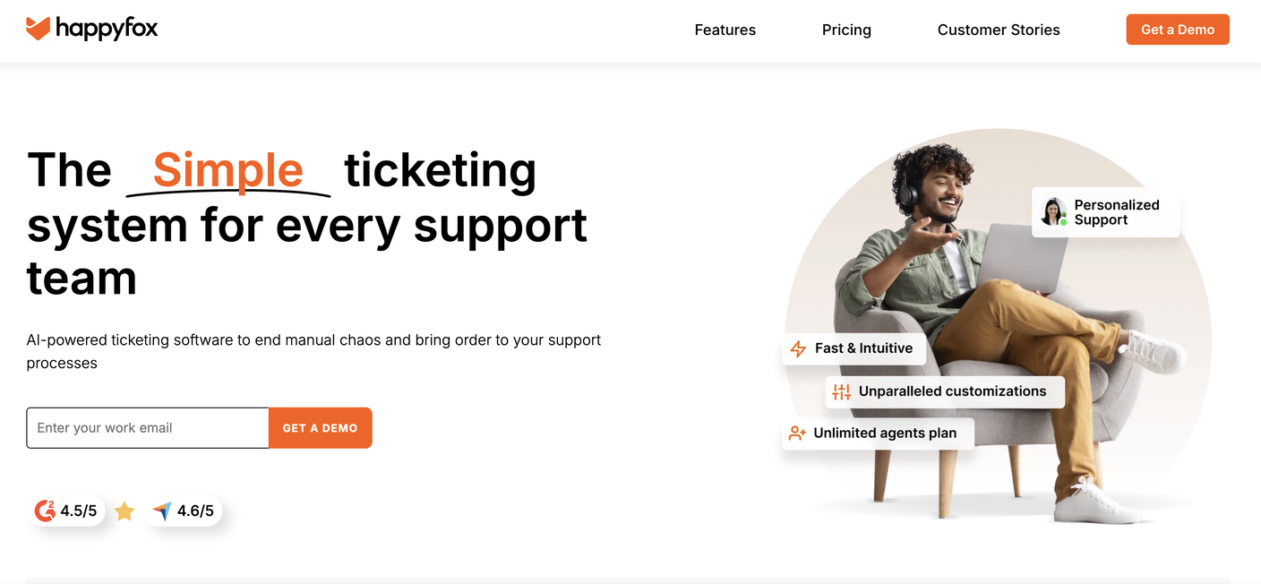
A few tools worth knowing, since "add trust signals" is easy to say and harder to actually do:
- Trustpilot reviews can be embedded directly into most landing page builders, including Unbounce, so a stranger sees real reviews on the page itself instead of clicking away to find them.
- For ecommerce specifically, Yotpo or Judge.me do the same thing with product-level reviews and photos.
- For B2B and SaaS, a G2 or Capterra badge does the same job the Trustpilot widget does for ecommerce, third-party proof, not just a claim you're making about yourself.
Session recordings: what do real visitors actually do on the page?
Everything up to this point has been us looking at the page and predicting how a stranger would experience it.
This test is different: we watch real people actually go through it.
A session recording shows exactly how a real visitor moved through the page:
- Where they paused
- Where they scrolled back up like they missed something
- Where they clicked something that wasn't actually clickable
- Where they got close to the form and then just... left.
This is where the gap between what we assumed would happen and what actually happens shows up.
We're watching for a few specific patterns:
- Rage clicks, when someone clicks the same spot repeatedly because something isn't responding the way they expect.
- Dead clicks, when someone clicks something that looks interactive but isn't.
- Hesitation right before a form, scrolling back to re-read something, or leaving right after landing, which usually means the five-second clarity test failed for a real person, not just a hypothetical one.
We don't need hundreds of sessions to find a pattern.
Usually 15 to 20 recordings of people who didn't convert is enough to see the same friction point show up again and again.
Microsoft Clarity is the tool we point almost anyone toward for this.
It's free, and it gives you real heatmaps and session recordings of actual visitors, which either confirms what the earlier tests predicted or shows you exactly where that prediction was wrong.
Checkout & lead-capture friction: how hard is it to finish?
I've audited enough checkouts at this point that very little surprises me anymore.
- A chat bubble sitting directly on top of the checkout button, so the button that's supposed to complete the sale is physically unclickable.
- A checkout that silently refuses to proceed because something else needed to be added to the cart first, with no message explaining why, just a page that won't move forward.
- A coupon code field sitting empty and prominent right before payment, which sends people away to search for a discount code instead of finishing the purchase they already decided to make.
- Shipping costs that show up for the first time on the very last screen, after someone's already mentally committed to the price they saw earlier.
None of these are exotic. They're common enough that most shoppers have hit one this month without registering it as a "bug," just as a reason to close the tab.
This is the last stretch, the final steps between someone deciding they want something and actually getting it, and usually the highest-leverage place to test since it's the closest point to revenue in the whole funnel.
For ecommerce, we walk the full path from cart to confirmation the way a real buyer would:
- Is guest checkout available, or is account creation forced before anyone can pay?
- Does the total stay stable the whole way through?
- Are modern payment options available (Apple Pay, Google Pay, Shop Pay) so someone can check out in a tap instead of typing a card number by hand?
- Does the confirmation actually confirm something, order number, what happens next, when to expect it?
For lead-gen and service businesses, the equivalent moment isn't a cart, it's what happens the instant after the form is submitted.
Does the visitor get routed somewhere useful right away, a calendar to book a call, a clear next step, or do they land on a page that just says "someone will be in touch" with no sense of when or how (more on that in check 10)?
The threat here is different, it's not "will my card get charged correctly," it's "did that actually work, and is anyone going to follow up."
Landing page destination: where is the ad actually sending people?
We check where the ad is actually sending traffic. It sounds obvious, but this is one of the most common gaps we find, budget going to a homepage instead of a page built for the one thing the ad promised.
A homepage has to serve everyone: new visitors, returning customers, people looking for support, people trying to find a careers page.
It's built for breadth.
A dedicated landing page has one job, matching one specific ad, one specific offer, one specific audience.
When paid traffic lands on a homepage, the visitor has to do the work of finding the thing they clicked for, and every extra click is another chance to leave before converting.
The test is simple:
- Does this page exist for the specific promise made in this specific ad?
- Or is it a general page hoping to work for everyone?
If it's the second one, that's usually the first fix, before anything else on this list.
The thank-you page: what happens after they convert?
Most funnels treat the thank-you page as the finish line. We treat it as the first move in the next conversion.
By the time someone lands here, they've already done the hardest part, they filled out a form, or completed a purchase. That's a moment of real trust and momentum, and a page that just says "thanks, we'll be in touch" wastes both.
The visitor doesn't know what happens next, doesn't know when to expect it, and has nothing else to do but close the tab.
A few things we check:
- Does the page set a clear expectation for what happens and when, "you'll hear from us within 1 business day" instead of silence.
- Is there an obvious next step available right now, a calendar link to book time directly instead of waiting on a follow-up email.
- For ecommerce, does the confirmation page make it easy to track the order, and is there a natural next action without turning the moment into a hard sell.
- Does the page's tone match what the visitor just did, a $50k demo request and a $40 product purchase shouldn't get the same generic "thanks!" message.
We did exactly this for a client not long ago: their thank-you page said "we'll be in touch soon" and left it there.
We swapped that for a direct Calendly link, so instead of waiting on a follow-up email that might land in spam or get lost in an inbox, the lead could book time on the spot, while they were still warm and still thinking about the decision they'd just made.
Conversion tracking: are the numbers even true?
This is the final thing we make sure of, and it's arguably the most important one on this list, because it's the one everything else depends on.
Before a dollar of spend goes out, we confirm that what we're about to optimize toward is actually being measured correctly.
- Do the conversion events fire when they should, and only when they should?
- Is the value attributed accurately, so a $50k deal isn't reported the same as a $500 one?
- Does the data feeding Google Ads, Meta, and GA4 reflect what actually happened in the business, not just what happened on the page?
This is the Signal stage of the framework we talk about across every post on this blog: Traffic, Conversions, Signal.
It's also the one many people trip up on, not because it's hard to explain, but because it's invisible when it's working and invisible when it's broken, right up until decisions get made on bad data.
Without this, every test on this list, every optimization, every dollar of spend, is being judged against numbers that might not be true.
Why does this come before ad spend?
None of these tests require a big budget or a long timeline. Most can be checked in a single working session. What they buy you is confidence that the traffic you're about to pay for is landing somewhere built to convert it, so that when we do turn spend on or scale it up, every dollar is working as hard as it can from day one.
If you want a second set of eyes on where your funnel might be leaking before you increase spend, that's exactly what our free audit is built for.
Quick Answers
Should you optimize your landing page before or after launching ads?
Before. Paid traffic is colder than organic traffic, so the landing page has to do more convincing with less patience. Running spend into a page with a leak makes every click more expensive, and most of these checks take a single working session to run.
How many CTAs should a landing page have?
One job per page. Two buttons can both serve that job when two real buyers need two different offers (a demo and a free trial), or when one buyer wants two ways to reach you (call or book online). If a second button exists because the offer needed a second explanation, the page has a message match problem.
Should paid ads send traffic to my homepage or a landing page?
A dedicated landing page. A homepage serves every kind of visitor, so a paid visitor has to hunt for the thing the ad promised, and every extra click is a chance to leave. A landing page built for one ad, one offer, and one audience removes that work.
What is message match in PPC?
Message match means the landing page repeats the promise of the ad that was clicked: the same headline language, the same offer, and the same call to action. When the page rephrases the promise, visitors wonder if they landed in the right place, and that moment of doubt costs conversions.
How many session recordings do you need to find conversion problems?
Usually 15 to 20 recordings of visitors who didn't convert. Friction shows up as a repeating pattern (rage clicks, dead clicks, hesitation at the form), and a pattern that's real usually shows up within the first couple dozen sessions.
What's the best free way to test a landing page on mobile?
PageSpeed Insights. Google retired its standalone Mobile-Friendly Test in 2023, and PageSpeed Insights now folds mobile usability, speed, and Core Web Vitals into one free report.
Keep reading: